Before we get into what does NOT work for Business to Business (B2B) ECommerce Landing Pages, let’s go over the basics. B2B Ecommerce is selling products or services between businesses through the internet. A landing page is a standalone web page. It is where your customer or potential client will start their journey on your site. You want to capture their attention as soon as they land on this page.
For successful landing pages, your customer or potential client should know the purpose of your landing page within the first 3 seconds. Read more how to keep users longer on your page here.
A good b2b landing page should contain the following:
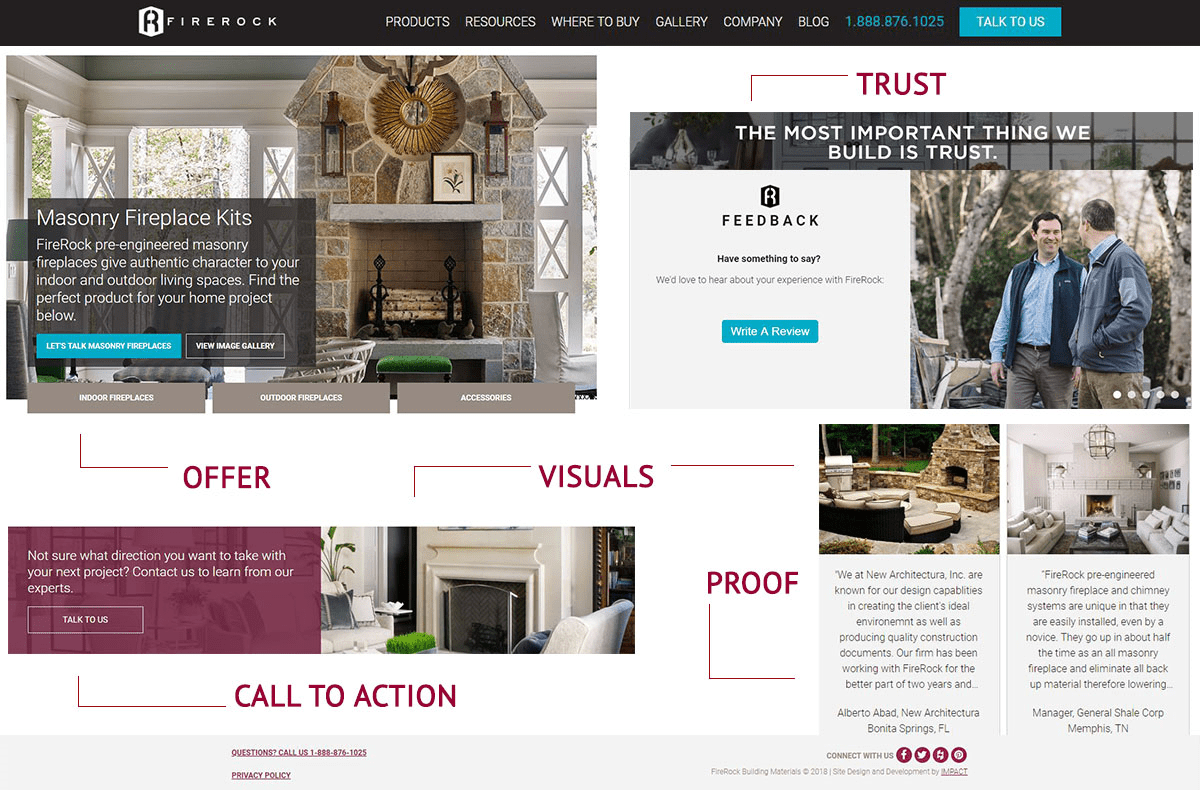
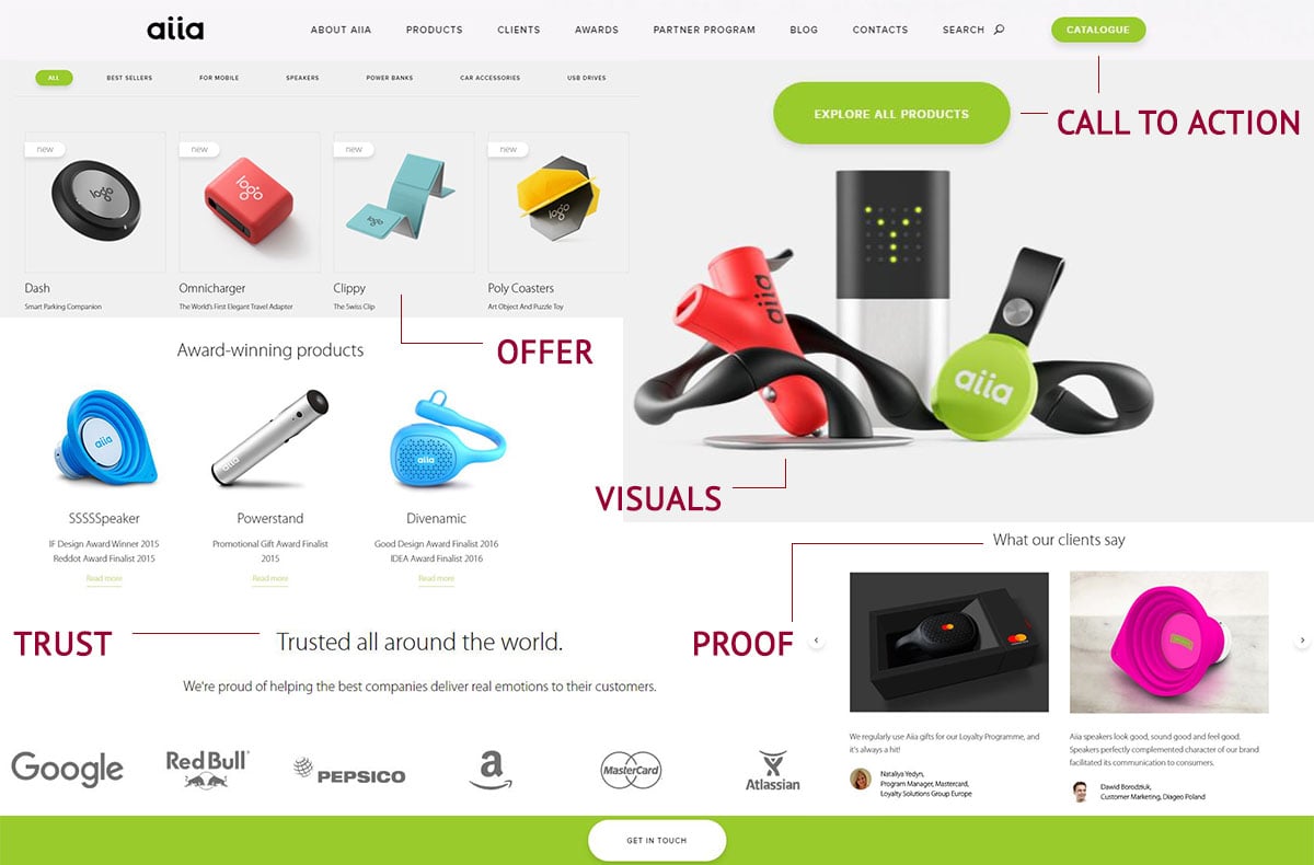
- Huge Win #1 Offer – The first thing someone sees when they get to your landing page is what you’re offering – whether it’s a service or product. Make sure you’re featuring it.
- Huge Win #2 Call to Action – You want to have immediate engagement when someone lands on this page. Whether it’s a buy now button, email form, or survey, make it simple and easy with no distractions.
- Huge Win #3 Proof- Provide proof to your customer that your products and services are legit with reviews and ratings, notable testimonials, available data and research, and case studies. Put your proof right below your call to action.
- Huge Win #4 Trust – Create trust on your landing page with your company branding and logo. Make sure to have a concise business overview on your page. Place notable company names and logos of other clients that you work with on your page. Include any PR inclusions with media and company logos on your page. At the bottom of your landing page, place credit card logos that you accept for trust in your payment acceptance methods.
- Huge Win #5 Visuals – Use visual examples to show the product. Use consistent imagery that has been used in Facebook advertisements, google advertisements, anything that drives leads to your page for consistency of branding. Use videos to help increase conversion & credibility. Make sure to focus on a sleek and simple design.
Now, that we’ve gone over the basics, let’s dive into:
What does NOT work for B2B ECommerce Landing Pages.
- Epic Fail #1 No Call To Action Buttons – Call to action buttons are key on any type of landing page to get someone to take an action. The call to action buttons should be relevant and prominent enough to grab someone’s attention. For B2B ECommerce, having an interactive call to action button to easily contact your business is essential for helping potential clients and current customers.
- Epic Fail #2 Overly Positive – You want to avoid sounding too positive. Avoid the 5 star rating only and show real testimonials with real people and companies. Using video testimonials is the best way to create trust and affirmation. Do not go crazy on the testimonials, limit the testimonials to 3-4 per each page.
- Epic Fail #3 Short and Simple Content – B2B Ecommerce should be content-rich and include things like white papers and case studies to create additional value as a thought leader in the industry. You want to your customers and potential clients to easily find helpful information on your industry, service or product.
- Epic Fail #4 One Call to Action and Purpose – B2B has a longer purchase decision process and buying cycle made by more than one person. Don’t limit your site to one call to action button. Use a few call to actions that will generate leads and overall help reach the main goal of the page. Offer a relevant case study or ebook for free if they enter their email to generate leads as a call to action on the page.
Important: you need to keep the major CTA (e.g. the order button) in a more contrasting color (red, orange), while the less important ones (e.g. download catalog) should be in subtle colors (grey, or white with a border). - Epic Fail #5 Boring and Complicated Page – The landing page should be user-friendly with visual aspects, autocomplete features, easily reached tools, and simple navigation. Comparison features and charts and service visualizations are great to utilize in business to business. The main aim of the B2B Ecommerce landing page is to make it easy for customers to work with you as a seller. The easier your landing page is to work with, the more your customers your customers will enjoy working with it.
- Epic Fail #6 Landing Page for the Masses – You need to figure out who your target demographic is and create a landing page targeted towards them. The landing page should not be generic. It needs to be specific for your niche.
- Use testimonials and reviews from companies and people in that demographic, and
- Offer useful information such as case studies and data that are helpful for that demographic.
When it comes to B2B Ecommerce sites, it is all about design, features, and functionality!
5 Great B2B ECommerce Landing Page Examples:
- Firerock provides high end building materials for custom homes and focuses on their customer service and expertise in the industry. Their homepage makes great use of photography and video to showcase their products while capitalizing on the trust they provide their customers. This B2B ECommerce website is very informative while keeping it simple and visual while showcasing their products, testimonials, blog and social media channels.
- Aiia is a B2B promotional gadgets company for corporations that utilizes a unique style and virtual experience on their site to showcase that promotional gadgets can be useful and creative rather than cheap-looking. Their product page offers a simple, user-friendly navigation showcasing each category of their products and a downloadable option for their catalog.
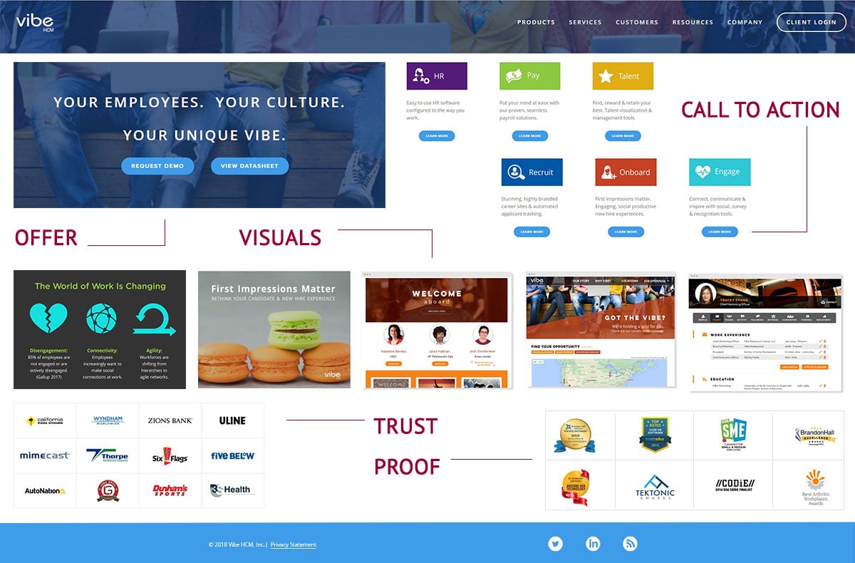
- Vibe is a payroll company with a very simple and clean landing page that is short and to the point. Immediately, they offer a free eBook as well as requesting a demo. As you move through the landing page, they showcase their services and products, offer a trust factor through reputable brands and case studies, and a chat option on their site.
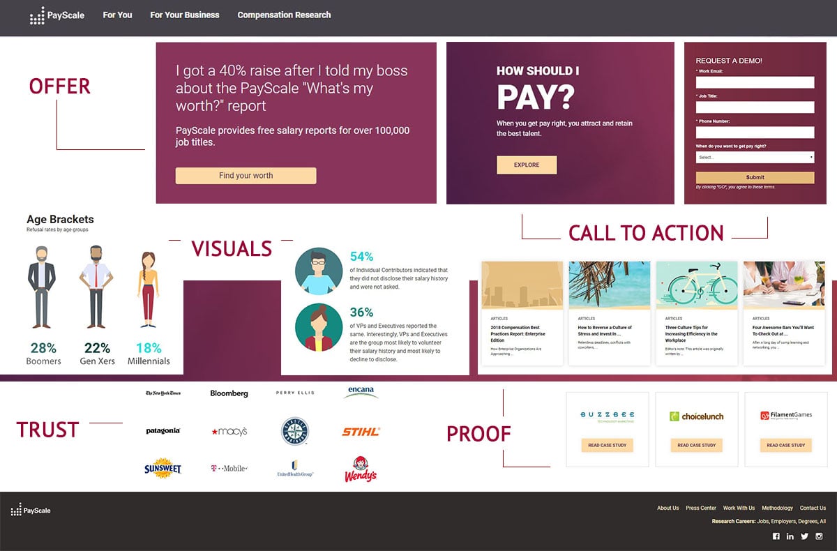
- Payscale showcases their services with a landing page all about handling your money correctly. This landing page is a perfect example of giving your visitors insight into who you are, while catering to what they need. They also provide accurate data that explains how they create their services.
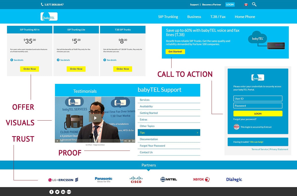
- Babytel helps businesses set up their phones and other contact devices. The slider image showcases what products the company is selling as well as offers. They feature a news section linking to articles, testimonials and partners.
Now that you know what to do and what not to do for B2B Ecommerce landing pages, you need to test and analyze page.
For A/B testing on your landing page:
- Do not test longer than a month
- Test copy/content.
- Try swapping forms & offers left to right.
- Break forms up.
- Test Pop Ups.
- Get a data analyst to look at the data.
Here are some great tools to conduct A/B tests and see how your page is performing.
- Hotjar – See where people are clicking with heat maps.
- Unbounce, Optimizly – Run A/B tests.
- Convert, Visual Web Optimizer – Run A/B tests and target.
Updated: July 8, 2022
Let’s work on this together: book a free work session
All companies we speak with have unique problems, and we’ve yet to find anyone who isn’t primarily plagued by too few resources. Take us up on a free training/work session where we can discuss your unique problems and offer solutions from top B2B marketers. Book one here: