Time on site is a very important SEO metric for Google. The introduction of the Chrome browser and its widespread adoption (64.5% market share as of 3/22) has made it easy for Google to measure if users find what they are looking for on your page.
Not only can Google easily measure the time users spend on your site, but also if the content is engaging: Google can measure whether your visitors read a section, watch a video, scroll down, fill in a form or click through to another page.
How long users stay on a page and how much they engage with it are key metrics for Google’s algorithm to rank pages in the search results.
That is why SEO strategies should shift from looking at only keywords and backlinks. Seeing if the page is interesting for the users allows Google to identify whether it is a good match for a certain query or not. And this should be the focus for your SEO strategy: you want Google to show your pages to as many users as possible, and since Google wants to keep users happy and engaged, that’s what you want too.
But, how to do that? Help is here! Let’s dive into the top 7 ways to increase time on site and improve your rankings, reduce bounce rate and grow organic traffic and lead flow.
Top 7 ways to keep users on your page, for longer:
#1: Technical: Make Pages Fast-Loading and Mobile-Friendly
Having a fast website (or at least faster than competitors’) is table stakes. The same goes for having a mobile-friendly site. If you don’t have either, you don’t stand a chance to get users to stay on your page – they will bounce right back to the search results. Unless you’re a famous brand, or there is some extenuating circumstance, users will NOT give extra effort and wait for your page to load. Even in those outlier situations, where some visitors are waiting for the page to load, you’re losing a good portion of your visitors to a competitor, and I’m sure you don’t want that. Even though your page will still rank for the brand terms, you’ll drop from the search results for the non-brand terms.
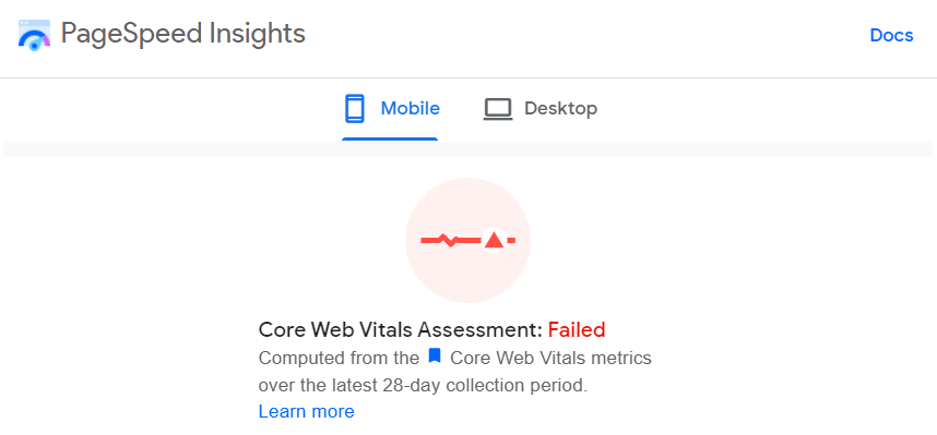
Bottom line #1: Make sure your pages load fast and are optimized for mobile browsing to get to have a shot at ranking and winning click throughs, then having a shot at on page engagement, in the SEO game.
#2: You’ve Got 3 Seconds to Tell Them What the Page is About
Let’s do an exercise: go to your website and try to look at it with fresh eyes, from the point of view of a newcomer. Is what you are offering clear? Can the user understand your message? What is available to them? How hard would a first time visitor have to think to get it? Do they see value in continuing with the page?
At TSG, we constantly see how hard it is to make a simple statement with web pages that is both clear and catchy, and both suitable for those who know you and those who don’t.
Marketers and leadership tend to look at big, famous brands for examples of slogans and taglines, but that’s simply wrong. For prospects who don’t know your brand, those you want to attract, (and let’s be honest, these are likely the majority of your visitors), having fancy taglines with zero meaning is useless and frustrating.
Some examples how *NOT* to say what you are doing:
Your success is our success!
The potential to make a difference.
Making the world stronger, safer, and smarter.
Bottom line #2: Tell what you offer simply and clearly. Make it easier for users to understand if they’ve come to the right place.
#3: Talk to Both Newbies and Experts
We see this all the time. Content on websites is very specific and high-level, and if you’re not an expert, you won’t understand a thing.
“But” you’ll say, “we want to show our users that what we offer is very professional and exactly what they need. And it’s the experts that would do the research.”
That’s true. But are they the only ones involved in making the decision? Might there also be purchasers, finance managers, operations managers, and sometimes the CEO, who would look at your product/service page before the money is spent? Are you talking to them as well? You should be.
Bottom line #3: Not only the experts make the decision to buy. Your page needs to have info for newbies as well.
#4: One Thing at a Time
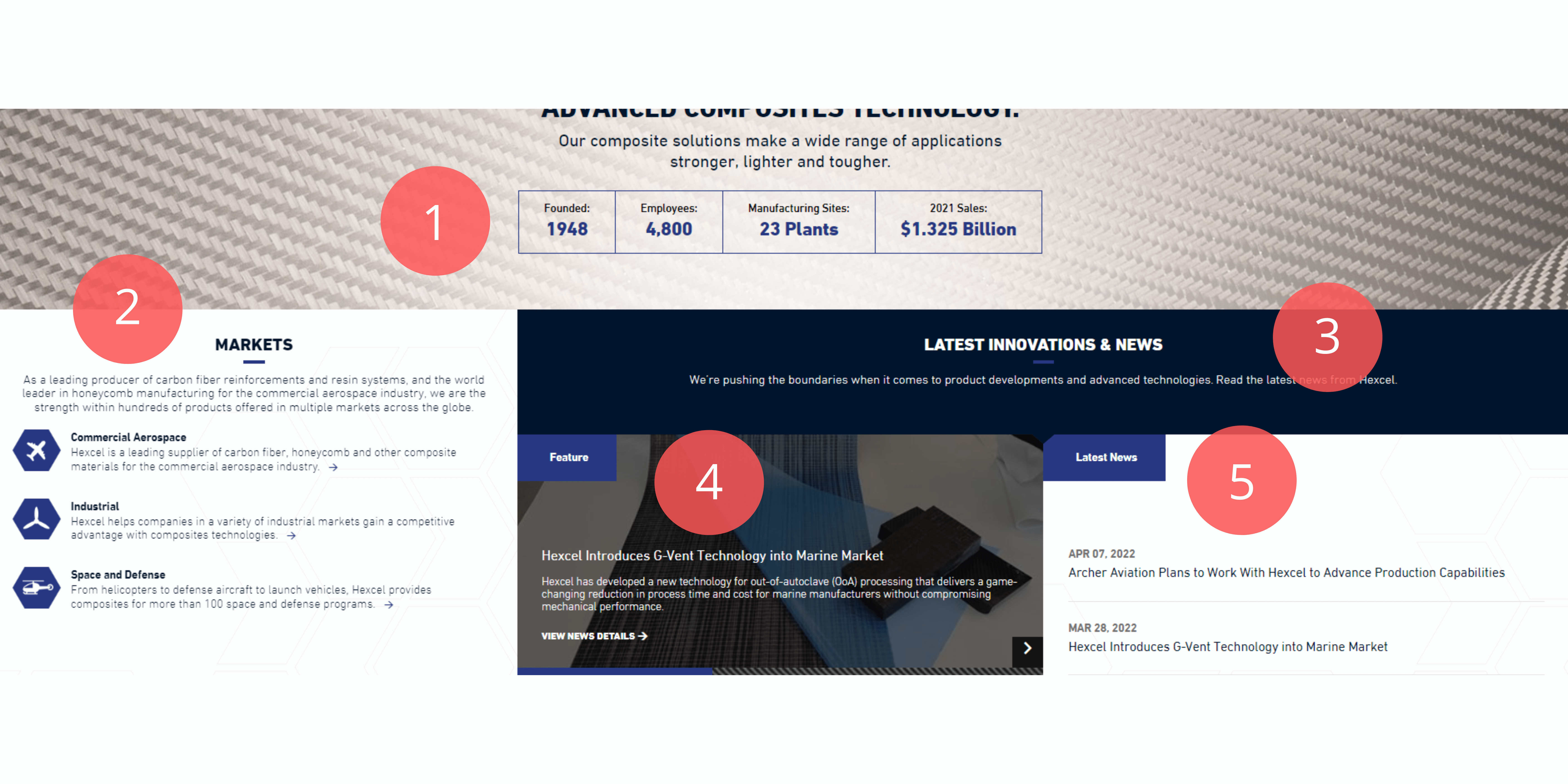
Have you seen cluttered pages? I’m sure you have! When you see a page with something on the left, a few things on the right and a couple of shiny call-to-action buttons, this gets confusing and leaves you wondering where you should focus your attention. Confusing your users is definitely not helping to keep them longer on the site. They get frustrated and distracted and are a click away from exiting your page.
Here’s an example of how *NOT* to confuse your visitors with too many things:
- If you are selling a product or service to other businesses (b2b), it’s highly probable that you need to explain some complex concepts that require users to put their learning hats on and understand what you are trying to explain.
- This is definitely not fun stuff. Learning new concepts is hard; our visitors are spending their (limited) time and attention.
- Your job is to make your visitor’s learning as easy as possible, and to make them want to invest time in what you’re teaching.
If you remember your days at school, new stuff was presented at a slow pace, one thing at a time and built on what you already knew. That’s how web pages should be built, too.
Bottom line #4: Start from the basics and build up if what you are selling is complex and users need to invest time and energy to learn about it.
#5: Clearly Separate Sections and Concepts from One Another
When you convey your message, you should let users know when you switch gears to the next concept or message – it should be clear where each begins and ends. That helps users arrange the new knowledge in their brains (aka cognitive system). How to do that?:
- Use different background.
- Use different content sections.
- Use subheadings and separators.
Bottom line #5: Show users where things start and end – that will make it easier for them to understand your messages.
#6: Videos Are Easier to Consume than just about Anything Else
Kids prefer movies over books, right? So do adults. Movies have it all – they are engaging, make use of multiple senses, convey messages clearly, and are shorter (vs. reading a book).
Playing an explainer video for a minute or so will save visitors time and provide context for what’s to come on the page. Without the video they are left to run around a web page, looking for what they need, then reading the info. Videos introduce visitors to a subject and videos prepare them to learn more of what interests them. Creating a good video, one that summarizes your marketing message, is not easy, but it’s definitely efficient, and time well spent.
Bottom line #6: Videos are a helpful and efficient way to convey a message.
#7: Show Visitors What’s Next
If you’ve managed to keep users on your page longer, and if you’ve managed to entice them to invest time in what you’re conveying, you now need to show them what’s next. Is it booking a demo or getting in touch with the sales team? Or are they ready to customize a product on their own?
This step has to be as easy as possible. Users are again (and always) calculating an ROI here – is what they would be getting worth the investment? The easier the choice, the higher the result of your marketing effort.
Bottom line #7: Show users an easy next step, a no-brainer that is nearly guaranteed to serve their needs.Let’s work on this together: book a free work session
All companies we speak with have unique problems, and we’ve yet to find anyone who isn’t primarily plagued by too few resources. Take us up on a free training/work session where we can discuss your situation and offer solutions from top B2B marketers. Book one here:

